 Dashboards
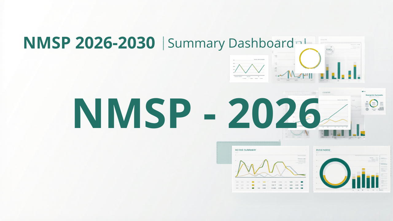
Malaria Strategic Plan Budget Summary Dashboard
Designed and built an interactive budget summary dashboard for the Nigeria National Malaria Elimination Programme (NMSP) 2026-2030 planning cycle. The project transformed complex multi-year cost sheets into a clean decision-support tool with filters, executive KPIs, exportable charts, branded visuals, and Tableau-ready outputs.
This project is a browser-based analytics dashboard created to help stakeholders explore and communicate the NMSP 2026-2030 budget more effectively. It turns raw Excel cost summaries into a polished interactive experience that supports both analysis and presentation.
The dashboard includes a branded header and a presentation-focused layout with institutional logos, summary cards, multiple chart types, and structured reporting tables. It was designed to be visually clean, easy to navigate, and suitable for high-level review meetings as well as technical budget exploration.
A key feature of the project is interactive filtering. Users can filter the dashboard by selected year range, objectives, interventions, and currency. These filters are applied consistently across the dashboard so that charts, KPI cards, and tables stay aligned with the user’s current view.
The dashboard also supports currency switching between Nigerian Naira and US Dollars using a fixed FX conversion rate. This allows both local and international audiences to interpret the budget in the currency most useful to them, while keeping the calculations consistent across charts and tables.
Several custom visualizations were built to highlight different budget perspectives. These include side-by-side total budget views in NGN and USD, small multiple charts for objective and intervention costs by year, a chart showing intervention percentage share of total cost, and donut charts that visualize each objective’s share of the total budget. Each chart was styled for clarity, compact number formatting, and presentation export.
To support reporting and stakeholder review, the dashboard also includes downloadable PNG exports for each chart. This makes it easy to reuse the visuals in slide decks, reports, briefs, and presentations without rebuilding them manually.
The final outcome is a practical analytics product that improves visibility into malaria programme budgeting, supports faster decision-making, and makes a complex multi-year funding plan easier to understand for technical and non-technical audiences.
Project Details
- Client: PATH and National Malaria Elimination Programme
- Date: Mar 26, 2026
- Technologies: R, Shiny, bslib, ggplot2, dplyr, tidyr, readxl, scales, Excel (.xlsx) as the source data format